
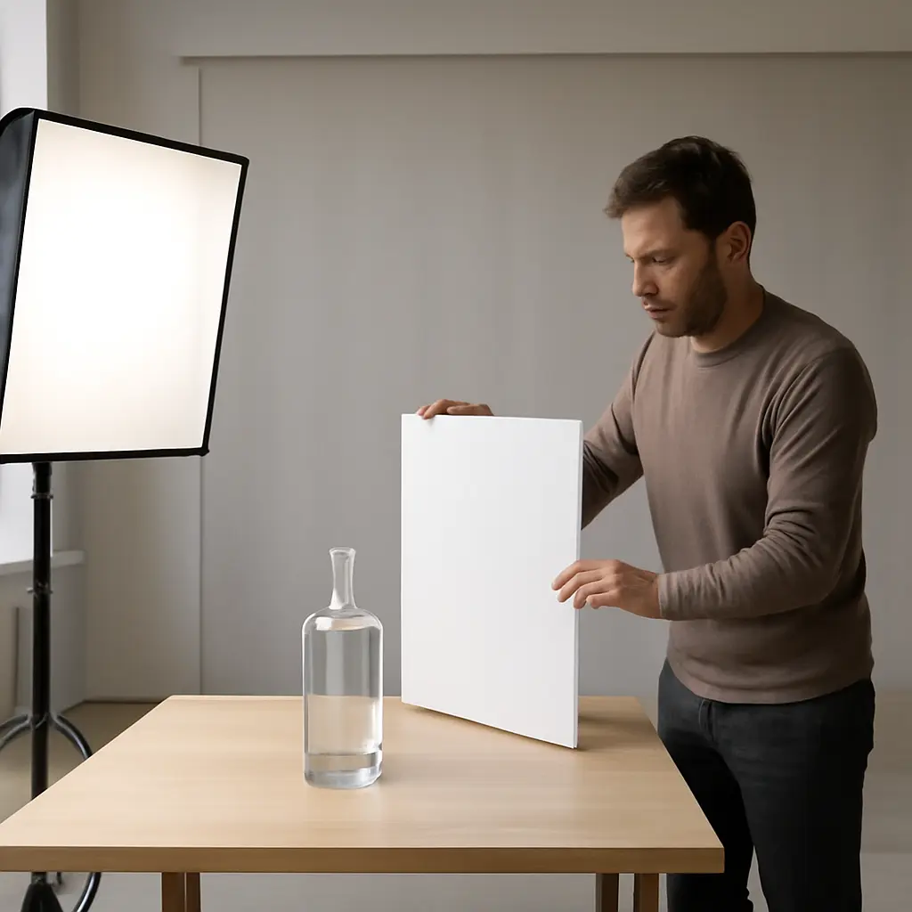
Product lighting and framing are deliberate choices of illumination, shadow, angle, and composition that shape how viewers perceive an object. They can make an everyday item feel polished and premium without changing the product itself: use broad, controlled light to reveal material quality, purposeful shadows to add depth, and clean framing to direct attention. These techniques matter in a visual marketplace: research published in the Journal of Business Research found that product images can affect consumers’ online purchase intentions, while Shopify reports that high-quality product photography helps customers assess products they cannot examine in person. The guide below explains lighting and framing principles, practical setups, common shot types, and a repeatable workflow for creating a high-end look.
Product Lighting and Framing: The Principles Behind a Premium Look
There is no single technical definition of “expensive-looking” product photography. In practice, it is an image-making approach that communicates quality through controlled highlights, legible surfaces, dimensional form, considered composition, and visual consistency. The goal is not simply to make an object brighter or more dramatic; it is to show its materials and design in a way that feels intentional and trustworthy.
Photographic lighting can be described by its direction, size, intensity, and color. Framing describes how the camera position, lens choice, subject placement, and surrounding space organize the image. Together, these choices influence whether a product looks tactile, refined, substantial, or inexpensive. A polished image usually preserves detail in both highlights and shadows rather than flattening everything into uniform brightness.
The commercial relevance is clear: a 2014 study in the Journal of Business Research examined how product photographs affect online consumer responses, including purchase intention. The authors’ findings support a practical point for sellers and creators: product images are not decoration alone; they are part of how a buyer evaluates an item when handling it is impossible.
Premium appearance is a result of visual control
A high-end impression often comes from restraint: one readable key light, carefully managed reflections, a background that supports rather than competes with the object, and a camera angle that clarifies the product’s form. Professional polish is therefore less about expensive equipment than about controlling what the viewer sees.
Different products need different visual evidence
A glass bottle needs clean edge reflections; a leather bag benefits from visible grain and shape; a watch needs legible dial details and controlled metal highlights. The lighting and framing should serve the product’s defining attributes, not apply the same dramatic look to every category.
Lighting Creates Product Shape, Texture, and Material Cues
Lighting is the arrangement and control of light falling on a subject. In product photography, its key characteristics include direction, apparent size, distance, intensity, color, and contrast. These qualities determine where highlights appear, how quickly shadows fall away, and whether a surface reads as glossy, matte, soft, or textured.
The basic lighting vocabulary includes key light, fill light, rim or edge light, bounce, diffusion, and negative fill. A key light establishes the main direction and shape; fill reduces shadow density; rim light separates an outline from the background; bounce redirects light with a reflective surface; diffusion softens a source; and negative fill absorbs stray light to deepen contrast. These are related tools, but they are not interchangeable: adding fill may reveal detail, while negative fill may restore definition to a reflective or pale object.
Large, diffused sources create controlled highlights
A light source appears larger to a subject when it is physically large or placed close. A large source, often softened with diffusion, usually creates broader and more gradual highlights than a small bare lamp. That makes it useful for products with curved surfaces, such as cosmetics packaging, ceramics, and polished appliances.
The source’s reflected shape matters as much as its brightness. A glossy bottle may reflect a softbox as an obvious bright rectangle; moving or reshaping that reflection can make the bottle look elegant rather than cluttered. For a small tabletop setup, a window with a sheer curtain can serve as a broad source, while white card can bounce light into the shadow side.
Directional light reveals texture and dimension
Directional light arrives from a defined side or angle and creates a clear transition between light and shadow. This transition reveals surface relief: stitching, brushed metal, embossed lettering, wood grain, or fabric weave. Frontal light can be useful for even catalog documentation, but it may suppress texture and make a three-dimensional object appear flat.
A useful starting point is to place the key light to one side of the camera, then adjust its height and angle while watching the product’s defining surface. For jewelry or glass, small changes can substantially alter reflections. For textured goods, a more grazing angle can emphasize relief, but excessive contrast may hide important information.
Fill and negative fill balance shadow detail
Fill light controls how dark the shadow side becomes. A white reflector or card can lift shadows without adding another powered light, while black card—negative fill—can create a darker reflection that strengthens the outline of a shiny object. The right balance depends on the desired impression and the product’s surface.
For example, a pale skincare jar may need dark cards at its sides to show its contour against a bright background. A dark leather wallet may need white bounce to reveal stitching and grain. In either case, preserve enough tonal detail for customers to understand the product rather than sacrificing clarity for drama.
Specular control is essential for reflective products
Specular highlights are bright reflections from smooth surfaces. Metal, glass, glossy plastics, and lacquered finishes reflect their surroundings, so the photographer is effectively arranging the environment that appears on the object. Large white cards can create clean highlights; black cards can define edges; flags can block unwanted reflections.
A practical method is to rotate the product or light in small increments while viewing the reflection, rather than simply increasing exposure. Polarizing filters can reduce some reflections on non-metallic surfaces, but they cannot remove every reflection and may also affect brightness or color. For metal, shaping reflected sources is generally more effective than expecting a polarizer to solve the problem.
Framing Directs Attention and Communicates Value
Framing is the selection and organization of what appears within the image. It includes viewpoint, camera-to-subject distance, lens perspective, subject scale, negative space, background, and the relationship between the product and the image edges. A strong frame makes the item easy to read and gives its design room to register.
Common framing approaches include centered packshots, three-quarter views, close-up detail crops, overhead flat lays, environmental compositions, and lifestyle images. Each serves a different purpose. A clean packshot supports straightforward identification; a three-quarter view shows multiple sides; a detail crop proves finish or construction; and an environmental image suggests use, scale, or mood.
Camera angle should clarify the product
A camera angle determines which surfaces and proportions are visible. A straight-on view can make a label easy to read, while a modest three-quarter angle often communicates volume. An overhead view works well for flat arrangements, but may understate the depth of a tall package.
Lens choice and distance also affect perspective. A wide-angle lens used close to a product can exaggerate near features and distort proportions. Stepping back and using a longer focal length can create a more natural-looking perspective, provided the available space and focus allow it. The appropriate viewpoint is the one that represents the object clearly and attractively without misleading the viewer.
Negative space gives the object room to feel considered
Negative space is the area around the subject that is not occupied by the product. It can make a frame feel calm, guide the eye, and leave room for text in an advertisement. Too little space can make an image feel cramped; too much can make a small object feel insignificant unless the composition intentionally uses scale and atmosphere.
For a premium impression, align spacing with the product’s visual weight. A small object may need a tighter crop or a supporting prop to feel purposeful, while a sculptural object can benefit from generous breathing room. Consistent margins across a product range also help a collection look professionally art-directed.
Background and props should support, not compete
A background establishes context and contrast. Seamless paper, a tabletop, textured fabric, stone, or an in-use setting can each work, as long as the choice supports the product’s material and brand character. Props can imply scale or use, but unnecessary objects introduce competing edges, colors, and reflections.
Shopify’s product photography guidance emphasizes the practical role of clear, consistent images in helping shoppers inspect products online. A useful application is to pair a consistent primary image with supplementary views that reveal details or context. This gives the customer both a clean comparison point and richer evidence about the item.
A Repeatable Workflow for a High-End Product Image
A repeatable workflow reduces guesswork and makes a set of product images feel coherent. Before shooting, identify the product’s most valuable visual evidence: its silhouette, finish, texture, construction, label, or scale. Then build the lighting and frame around those priorities.
- Clean the product and remove dust, fingerprints, and packaging imperfections that will be prominent in close-ups.
- Choose a background and camera angle that show the item’s shape and intended use accurately.
- Set one key light and observe where its highlights and shadows fall before adding more equipment.
- Use diffusion, bounce, flags, or negative fill to shape the surface reflections and shadow detail.
- Check the frame at full size for distracting edges, clipped highlights, awkward crops, and unreadable labels.
- Capture a consistent primary view, then add detail and context images that answer likely customer questions.
- Review the images together to confirm consistent color, exposure, scale, and spacing across the collection.
A simple diagram could show a product between a diffused key light and a white bounce card, with black flags placed to control edge reflections. This illustrates a useful principle: the setup is not merely “lights around an object”; it is a deliberate arrangement of bright and dark surfaces that the object reflects.
Common Mistakes That Make Products Look Less Expensive
The most frequent errors are uncontrolled glare, flat frontal illumination, mixed color temperatures, distracting props, inaccurate color, and inconsistent framing. Over-sharpening or excessive retouching can also make a real product appear artificial and undermine trust.
- Blown highlights: Bright areas lose surface detail, especially on white packaging and reflective finishes. Adjust the light or exposure rather than assuming every highlight should be pure white.
- Unintended color casts: Mixing daylight with warm household bulbs can make neutral surfaces look inconsistent. Use a consistent light source and check white balance.
- Flat lighting: Too much frontal fill can erase contours and texture. Restore directional shape with a side key or negative fill.
- Distracting reflections: Rotate the object, reshape the source, or add flags to remove unwanted shapes in glossy surfaces.
- Misleading color or scale: Keep color faithful and include context or a reference view when dimensions are not obvious.
- Inconsistent crops: A product range can look careless when the subject size, margins, or camera angle changes without purpose.
The strongest correction is often a small physical change before editing: move the light, rotate the product, adjust a card, or change the camera height. Editing can refine an image, but it cannot reliably recover surface detail that was lost to clipped highlights or a poorly chosen reflection.
Conclusion: Use Light and Composition to Prove Product Quality
Product lighting and framing work together to make quality visible. Large diffused sources control highlights; directional light reveals texture; fill and negative fill shape shadows; and considered angles, negative space, and backgrounds guide attention. The best setup depends on the product’s material and on the information a buyer needs to see.
Because online shoppers rely on images to judge products they cannot handle, clarity and consistency are commercial as well as aesthetic concerns. Start with one light, study the reflections, and build the frame around the object’s strongest features. For further practice, compare several lighting angles for the same product and note which version communicates its material, shape, and finish most truthfully.
Sources: Pieters, Rik and Michel Wedel, “Attention Capture and Transfer in Advertising: Brand, Pictorial, and Text-Size Effects,” Journal of Marketing, 2004, https://doi.org/10.1509/jmkg.68.2.36.27794; Kim, Minjeong and Lennon, Sharron J., “Effects of reputation and website quality on online consumers’ emotion, perceived risk and purchase intention,” Journal of Business Research, 2013, https://doi.org/10.1016/j.jbusres.2012.07.008; Shopify, “Product Photography: How to Take Pictures of Products,” https://www.shopify.com/blog/product-photography; Cambridge in Colour, “Lighting and Photography,” https://www.cambridgeincolour.com/tutorials/lighting.htm.


